
Every web project hits the same awkward moment. The client has seen a mood board full of inspiring photos and says “yes, I love it”, then sees the first full homepage mockup and says “actually, that is not what I pictured at all”. Two weeks of layout work gone.
The fix is a small deliverable that sits between those two stages: the style tile. At PixelBright we build one on almost every website project, and it is the single cheapest way we have found to lock a visual direction before anyone touches a page layout.
What is a style tile in web design?
A style tile is a one page design deliverable that shows the visual language of a website: colors, typography, buttons, form fields, icons, imagery treatment and a short set of adjectives describing the tone. It is not a page. It has no navigation, no hero layout, no content hierarchy.
The concept was formalised by designer Samantha Warren (styletil.es) as a response to a real problem: clients could not read mood boards, and full mockups were far too expensive to iterate on. A style tile communicates how the site will feel without committing to how the site will be arranged.
Think of it the way an architect uses material samples. Nobody argues about the floor plan while holding a piece of oak and a brass handle. You agree on materials first, then you draw rooms.
Why style tiles exist in the first place
- Mockups mix two conversations. When a client reviews a full homepage, feedback about color gets tangled with feedback about layout, copy and image choice. Nothing gets resolved cleanly.
- Mood boards are too vague to approve. A grid of Pinterest images means something different to every person in the room.
- Responsive design killed the “three homepage concepts” model. Designing three full comps for mobile, tablet and desktop is unaffordable. Designing three style tiles is not.
- Design systems start here. The tokens you agree on in a style tile become your Figma variables, then your CSS custom properties. Nothing is wasted.

Style tile vs mood board vs mockup: the real difference
These three deliverables are often confused, especially by clients who have never run a web project. Here is the clean separation we use in our proposals.
| Mood board | Style tile | Full mockup | |
|---|---|---|---|
| Question it answers | What world does this brand live in? | What will the site be made of? | What will this specific page look like? |
| Content | Found imagery, textures, references, competitor screenshots | Original design elements: palette, type scale, buttons, inputs, icons | Real layout, real copy, real hierarchy, responsive states |
| Original work? | No, mostly curated | Yes, fully designed assets | Yes |
| Layout decisions | None | None, deliberately | All of them |
| Typical build time | 1 to 3 hours | 3 to 6 hours per direction | 1 to 4 days per page |
| Cost of a revision | Very low | Low | High |
| Reusable output | Rarely | Becomes the design system foundation | Becomes the build reference |
The short version: a mood board is borrowed inspiration, a style tile is designed intention, a mockup is applied decision.
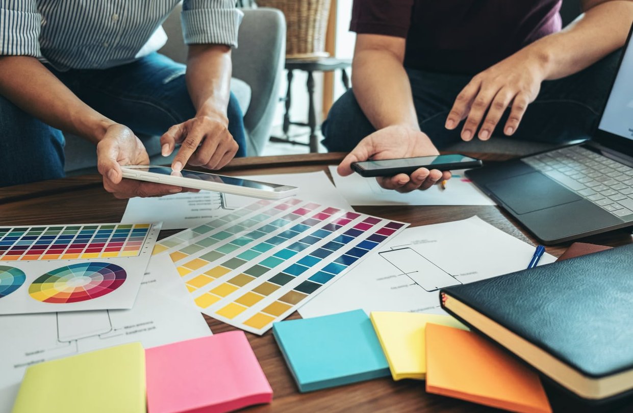
What a style tile actually contains
There is no official template, but a style tile that fails to lock direction is almost always missing one of the items below. Here is the checklist we work through.
1. Color palette with roles, not just swatches
Do not show six circles and call it a palette. Label the function of each color so the client understands the hierarchy:
- Primary (brand anchor)
- Secondary and accent (used for calls to action)
- Neutrals: a ramp of 4 to 6 greys for backgrounds, borders, muted text
- Semantic colors: success, warning, error, info
- Surface colors: page background, card background, and the dark mode equivalents if the project needs them
Include hex values and a contrast note. Showing that body text hits 4.5:1 contrast on the chosen background is a quiet accessibility win that clients remember.
2. A real type scale
Not “Headings: Söhne. Body: Inter”. Show the scale in use:
- H1 through H4 with pixel or rem sizes, weights, line heights and letter spacing
- Body copy at its real reading size with a full paragraph of text, not lorem ipsum fragments
- Small text: captions, labels, legal
- Link styling in default, hover and visited states
- A blockquote or pull quote if the brand is content heavy
A paragraph of realistic copy is the moment many clients first understand whether the site will feel editorial and calm or dense and technical.
3. Buttons and interactive elements
This is the part clients react to most strongly, because it is the part they will click.
- Primary, secondary and tertiary (or ghost) buttons
- All states: default, hover, focus, active, disabled
- Corner radius, shadow treatment, border weight
- Form inputs: text field, select, checkbox, radio, plus an error state
- Tags, badges, pagination or a simple card component
4. Imagery and illustration treatment
Explain how photography will be handled, not just which photos exist:
- Crop style (full bleed, rounded, masked shapes)
- Color grading or duotone overlays
- How text sits over images (scrim, gradient, solid block)
- Icon family and stroke weight
- Illustration or 3D style, if used
5. Texture, spacing and motion notes
- Base spacing unit (we usually work on a 4px or 8px grid)
- Border radius token values
- Elevation and shadow levels
- Dividers, background patterns, gradients, noise
- A one line motion principle, for example “transitions are fast and subtle, 150ms ease-out, no bouncing”
6. Adjectives and the logo
Three to five adjectives sit at the top of the tile: confident, warm, precise. These are the words you will quote back during feedback. Place the client logo nearby so the palette is judged next to the brand mark it has to live with.
How to build a style tile in Figma: a practical walkthrough
Figma is the natural home for this deliverable because the tile output and the design system tokens are the same objects. Here is the workflow we use.
Step 1: Set up the canvas
- Create a frame at 1200 x 2000 px. Portrait works better than landscape because clients scroll on laptops and phones.
- Set a 12 column layout grid with 24px gutters so blocks align without you thinking about it.
- Create a page named
01 Style Tilesand keep exploration scraps on a separate page named99 Scratch.
Step 2: Define variables before you design anything
Open the Variables panel and create collections:
color/brand/primary,color/brand/accentcolor/neutral/100throughcolor/neutral/900color/semantic/success,error,warningradius/sm,radius/md,radius/lgspace/1throughspace/10
This takes fifteen minutes and saves hours later. When the client asks to “warm up the blue”, you change one variable and the entire tile updates. If you have set up a mode for dark theme, you get a second presentation for free.
Step 3: Build the blocks
Work top to bottom in this order. The order matters because each block informs the next.
- Header strip: client logo, project name, direction name (“Direction A: Quiet Authority”), date.
- Adjectives: three to five words, large type, plenty of space.
- Color block: swatches as rectangles with the role name and hex below. Use an auto layout row so reordering is one drag.
- Typography block: a styled specimen showing H1 to H4, body, small, link. Create Figma text styles as you go.
- Buttons and forms: build each as a component with variants for state. Variants here become your real components later.
- Imagery block: two or three treated images at the actual treatment you intend to use.
- Extras block: icons, a card, a tag, a divider, a shadow sample.
Step 4: Produce two or three directions, not five
Two is usually right. Three is the maximum. Each direction should be genuinely distinct, not the same tile in different colors. Give each a name that describes a feeling rather than a letter: “Clinical and Clear” versus “Editorial and Human”. Named directions get discussed on their merits. Lettered ones get picked at random.
A useful trick
Duplicate the first tile, then change only one structural decision in the second: a serif instead of a sans, or generous whitespace instead of dense blocks. This isolates the variable and makes client feedback far more specific.
Step 5: Add a context strip (optional but powerful)
Some clients cannot abstract. For them, add one small 400px wide fragment at the bottom of the tile: a single card, or a hero headline with a button over an image. It is not a layout, it is proof that the ingredients work together. Label it clearly as “Fragment only, not a page design” so nobody starts critiquing the menu.
Step 6: Prepare the handoff
- Export a PDF for email and keep the Figma link for live review.
- Turn on comments and restrict editing.
- Add a short written rationale inside the file, in a column beside each tile.
How to present a style tile to a client and actually lock the direction
A style tile only works if it is presented properly. Sent silently by email, it generates the worst feedback of the project. Here is the script we follow.
Before the meeting
- Send nothing in advance, or send it no more than two hours before. Early delivery means the client forms opinions alone and arrives defending them.
- Confirm the decision makers are in the room. A style tile approved without the founder present will be unapproved by the founder next week.
During the meeting
- Restate the goal in one sentence. “Today we are agreeing on the visual language only. We are not looking at layout, content or page structure yet.” Say it twice.
- Reconnect to the brief. Read back the adjectives and the audience you agreed on during discovery, then show how the tile delivers them.
- Walk the tile in order: adjectives, color, type, components, imagery. Explain the reason for each choice. “We chose a 17px body size because your audience skews over 45 and reads long articles.”
- Present directions one at a time. Never show all directions at once on screen. Side by side comparison triggers feature mixing, where a client asks for the type from A with the color from B and the mood of C.
- Stay quiet after each direction. Let the first reaction come from them.
Framing the feedback
Replace “what do you think?” with questions that produce usable answers:
- “Does this feel like the company you want to be in three years?”
- “Which of these two would your most skeptical customer trust more?”
- “Is there anything here that contradicts your brand guidelines?”
- “On a scale of one to five, how close is this to right?” Then: “What would make it a five?”
Closing the loop
- Collect feedback, consolidate it into a single list, and remove contradictions before the next round.
- Allow one revision round on the chosen direction. Two if the project is large. State the limit in the proposal.
- Get explicit written sign off: “We approve Direction B with the noted adjustments as the visual direction for the website.” An email reply is enough, but get it in writing.
- Only then start wireframes or layout design.
That sign off is your anchor. When someone says in week six that the green feels cold, you reopen the approved tile and have a calm, documented conversation instead of an argument.

Common style tile mistakes
| Mistake | Why it hurts | Fix |
|---|---|---|
| It looks like a homepage | Client critiques layout and the direction conversation dies | Remove navigation, remove hero sections, keep blocks clearly disconnected |
| No interaction states | Hover and focus get invented during build, inconsistently | Show every button and input state on the tile |
| Placeholder lorem text | Client cannot judge readability or tone | Use real or realistic copy from the client’s own material |
| Five directions presented | Decision paralysis, then a request to blend them all | Two or three, each clearly distinct and named |
| No accessibility check | Palette fails contrast and has to be reworked mid build | Test every text and background pair before presenting |
| Skipping sign off | Direction reopens during layout, schedule slips | Written approval before any layout work begins |
When you should skip the style tile
It is not mandatory on every project. Skip it or compress it when:
- The client has a mature design system already, in which case you produce a short “web application” note instead, covering only what the system does not define.
- The project is a single landing page with a one week timeline and a single decision maker.
- You are working in browser first with a client who is comfortable reviewing live HTML. A styled component page in code does the same job.
On a multi page marketing site, an ecommerce build or anything with a committee of stakeholders, the style tile pays for itself on the first avoided revision round.
From style tile to design system
The last advantage is the one agencies undersell. Because you built the tile with Figma variables and component variants, approval does not just unlock layout work, it hands you:
- A token set ready to export to CSS custom properties or a Tailwind config
- Button and input components already built with states
- A documented type scale that the developer can implement without guessing
- A reference document for future pages, campaigns and third party collaborators
A mood board gets archived. A style tile becomes infrastructure.
FAQ
What is a tile in web design?
Two different meanings are in circulation. In layout terms, a tile is a rectangular content block used in grid or card based interfaces. In the design process sense discussed here, a style tile is a one page deliverable presenting the colors, type, buttons and imagery treatment of a site before layout work starts.
Is a style tile the same as a style guide?
No. A style tile is exploratory and comes early, offering a direction for approval. A style guide or design system is documentation that comes after approval and defines rules, usage and edge cases in detail. The tile is the seed, the system is the tree.
How long does it take to create a style tile?
Roughly three to six hours per direction once discovery is complete and brand assets are in hand. Two directions typically fit in a single day of focused work.
Can you provide an example of a style tile?
A typical tile reads top to bottom: client logo and direction name, three adjectives, a labelled color palette with hex codes, a type specimen from H1 to caption, a row of button variants with hover and disabled states, two treated photographs, and an icon set. No navigation bar, no hero section, no page structure.
Should I use a style tile template?
Templates are useful for speed, and the Figma Community has plenty of free ones. Use them as a starting structure, then adapt the blocks to the project. A tile for a B2B SaaS product needs form states and data table styling, while a tile for a restaurant site needs photography treatment and menu typography. Identical tiles across every client is a sign the process has become decorative.
Do style tiles work for mobile first projects?
Yes, and they are arguably more valuable there. Because a tile has no layout, it is inherently resolution independent. Just make sure the type specimen shows the mobile body size alongside the desktop one, and that tap targets on buttons meet the 44px minimum.
Who should be in the style tile approval meeting?
Everyone who can veto the direction later. Typically the marketing lead, the brand owner and the final budget holder. If one of them cannot attend, reschedule rather than present twice.
Ready to lock your visual direction?
At PixelBright, every website project includes a style tile stage before layout begins. It shortens the approval cycle, removes the guesswork from design reviews and hands your developers a token set instead of a screenshot. Get in touch to talk about your next build.