
What Is a Mockup in Graphic Design?
A mockup in graphic design is a realistic visual preview that shows how a finished design will look once it is printed, worn, packaged or displayed on a screen. It is usually a photograph or 3D render of a real object (a business card, a coffee bag, a t-shirt, a phone) with an editable layer where your artwork is dropped in. The result looks like a photo of the finished product, even though the product does not exist yet.
In other words, a mockup answers one question for your client: “What will this actually look like in real life?” Flat files on a white background rarely answer that. A mockup does.
At PixelBright we treat mockups as a presentation tool first, not a decoration. Used well, they shorten approval cycles. Used badly, they hide flaws that only appear at production stage, which is where budgets get burned.
The short definition to remember
- A mockup = static, high-fidelity, realistic. It shows appearance and context.
- It does not contain working functionality.
- It is built for review, approval and presentation, not for user testing of interactions.
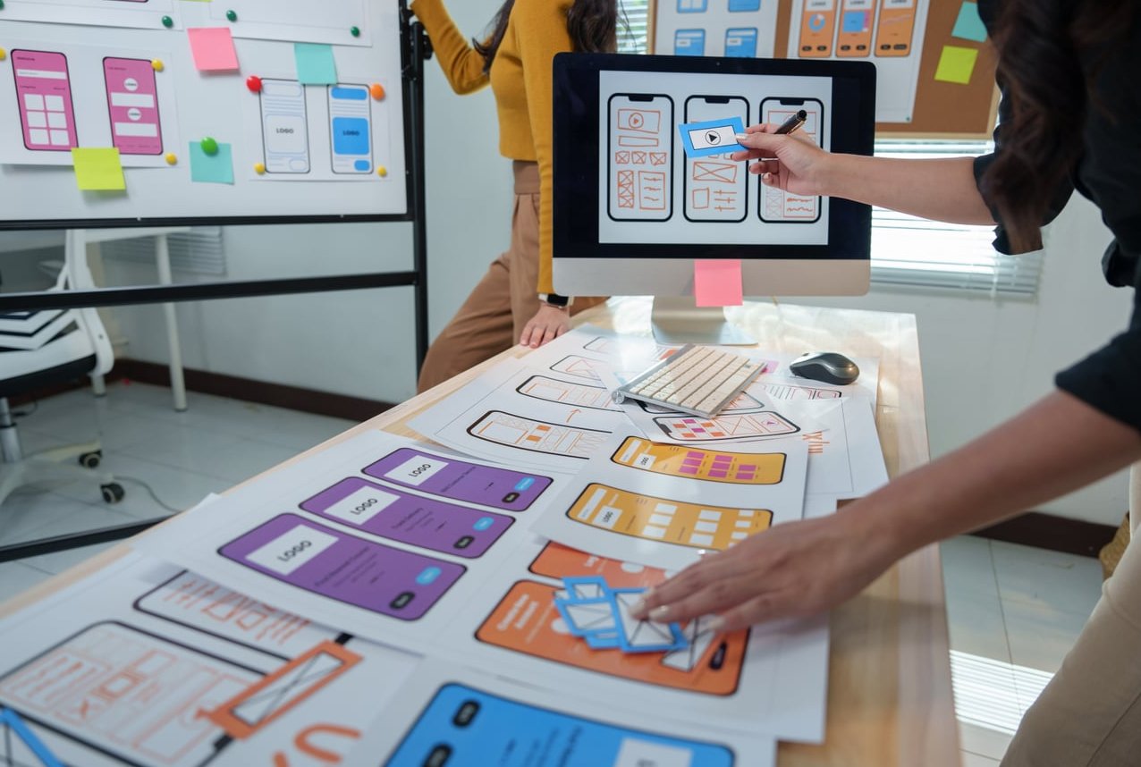
Mockup vs Prototype vs Wireframe vs Template
These four words get mixed up constantly, including in client emails. Here is the clean separation:
| Term | Fidelity | Interactive? | Main purpose |
|---|---|---|---|
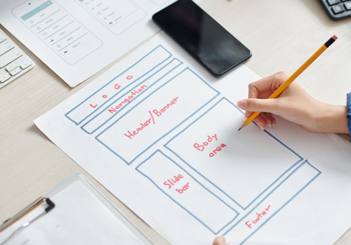
| Wireframe | Low (greyboxes, no styling) | No | Structure, hierarchy, content blocks |
| Mockup | High (final colours, type, imagery) | No | Show the visual result in context, get sign-off |
| Prototype | Medium to high | Yes (clicks, transitions, flows) | Test behaviour and usability |
| Template | Variable | No | A reusable starting layout you fill with your own content |
The simplest way to explain it to a client: a wireframe is the floor plan, a mockup is the photo of the finished room, and a prototype is walking through the house and opening the doors. A template is the empty shell someone else built that you move into.
Mockup vs model
A model is often a physical or 3D object built to scale (common in architecture and product design). A mockup in graphic design is almost always a flat, 2D visual that simulates a real object. Physical mockups exist too (a hand-built folding carton, a printed dummy book), and they remain the best way to validate paper stock, folds and finishes.
Why Mockups Matter When You Present Client Work
Clients are not trained to read flat artboards. They look at an isolated logo in black on white and see nothing. Put that same logo on a shop window, a van and a tote bag, and suddenly they understand what they are buying.
Concretely, mockups help you:
- Remove abstraction. Scale, material and context become obvious.
- Catch problems early. A logo that dies at 15 mm on a pen is a problem you want to see before print, not after.
- Reduce rounds of revisions. Fewer “I can’t picture it” emails.
- Justify your rates. A presentation that looks like a finished brand feels worth more than a PDF of flat files.
- Align stakeholders. Marketing, sales and the CEO all read the same image the same way.
The Main Types of Mockups Designers Use
1. Print mockups
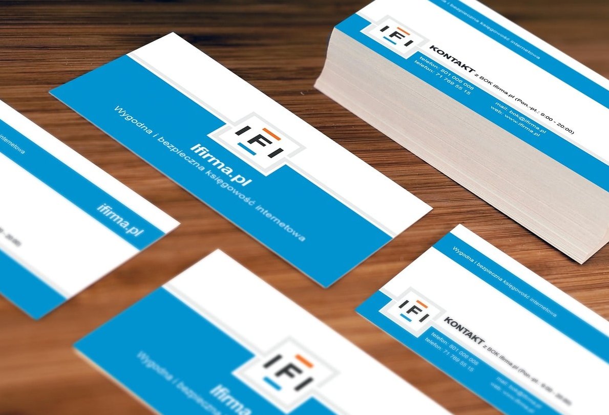
Business cards, letterheads, flyers, posters, brochures, books, menus, stickers.
- Best for showing paper stock, folds, spot UV, foil, embossing and trim size.
- Watch the thickness of the card and the edge colour: a 600 gsm cotton card with a painted edge needs a mockup that shows it.
- Always present at least one flat front/back view alongside the styled scene.
2. Packaging mockups
Boxes, pouches, coffee bags, bottles, jars, cans, tubes, labels, shipping cartons.
- The hardest category, because curvature, reflections and shelf context change everything.
- Check that the mockup respects the real dieline. A generic box render that is not your actual structure will mislead the client.
- Add a shelf or retail context shot if the product competes in store. A pack that looks beautiful alone can disappear between competitors.
3. Apparel and merchandise mockups
T-shirts, hoodies, caps, tote bags, mugs, uniforms, lanyards.
- Fabric texture and folds matter: your artwork should follow the wrinkles, not float on top.
- Match the print method. Screen print, DTG and embroidery do not look alike, and embroidery in particular kills fine detail and gradients.
- For apparel, flat lay mockups usually read better for approval, while on-model shots sell the concept.
4. Device and screen mockups
Phones, tablets, laptops, desktop monitors, smartwatches, TV screens.
- Use current-generation devices. An old phone frame instantly dates a deck.
- Respect real screen ratios and safe areas, including notches and rounded corners.
- Show mobile first if the client’s traffic is mobile. Most of it is.
5. Environmental and signage mockups
Storefronts, billboards, vehicle wraps, exhibition stands, wall graphics, window vinyl.
- Excellent for proving legibility at distance and how a brand behaves at large scale.
- Be honest about location. A billboard in a glamorous city square is not the client’s reality if their sign sits in an industrial park.
6. Social and digital asset mockups
Feed posts, stories, ad placements, email headers, profile branding.
- Check crop safety: platforms crop aggressively, and a mockup is a good place to prove your design survives it.
How to Pick a Realistic Mockup (and Not a Misleading One)
Not all mockups are equal. Before you commit a scene to a client deck, run this checklist:
- Does the object match the real deliverable? Correct format, correct structure, correct finish. A square card mockup for a rectangular card is an instant credibility loss.
- Is the resolution high enough? Aim for a file you can crop into without mush. Presenting on a large screen is unforgiving.
- Is the lighting neutral? Heavy coloured lighting shifts your brand colours and your client will remember the wrong hex code.
- Is the perspective readable? Extreme angles look cinematic but hide half the layout.
- Are the props relevant? Coffee cups, plants and sunglasses scattered around a logo add nothing. Props should reference the client’s industry or disappear.
- Is the licence clear? Check commercial use rights before a mockup ends up in a client presentation or on your portfolio. Free does not always mean free for commercial work.
- Does it include an editable smart object? If you cannot place artwork cleanly, skip it.
Realistic does not mean fancy
The best mockup is the one that represents production conditions most honestly. A plain white studio shot of a bottle on a neutral background can be far more useful than a moody scene with water droplets and dramatic rim lighting.
How to Apply Artwork with Smart Objects (Step by Step)
Most professional mockups ship as layered PSD files built around smart objects. A smart object is a container layer: whatever you paste inside is automatically warped, shaded and blended to match the scene.
In Photoshop
- Open the PSD and find the layer usually named something like “Your Design Here”, “Place Artwork” or “Smart Object”.
- Double-click the smart object thumbnail. A new tab opens with a blank canvas at the right dimensions.
- Paste or place your artwork inside that tab. Use Place Embedded or Place Linked rather than copy-paste when possible, and keep vectors as vectors.
- Scale and position your design against the guides provided (bleed and safe areas are often marked).
- Save with Ctrl/Cmd + S and close the tab. The main document updates automatically with lighting, folds and perspective applied.
- Adjust the colour or shadow layers if the mockup provides them (background colour layers, fabric colour, highlight overlays).
- Export at high resolution, typically PNG or JPG at 2x the display size for retina-quality decks.
Quick troubleshooting
- Artwork looks flat and pasted on: the displacement or multiply overlay layer is probably switched off. Turn the shading group back on.
- Colours look dull: the mockup may be in CMYK or have a colour grading layer on top. Check the document profile.
- Edges look blurry: you placed a raster file that is too small inside the smart object. Replace with vector or a larger file.
In Figma
Figma has no true smart objects, but you can get close:
- Use an image fill on a frame and set the blend mode to Multiply over the product photo so shadows show through.
- Use plugins that handle device frames and perspective for screen mockups.
- For complex curvature (bottles, pouches), go back to Photoshop or a 3D tool. Figma will not warp convincingly.
In Illustrator or Affinity
- Illustrator’s 3D and Mapped Artwork features can wrap vector art onto simple shapes, useful for cans and cylinders.
- Affinity Photo supports linked layers and displacement maps for a similar workflow to Photoshop.
Online mockup generators
Browser-based generators are fast and fine for quick drafts, social previews or internal checks. For final client presentations, a layered file gives you more control over colour accuracy, shadow intensity and crop.
The Over-Styled Mockup Trap
This is where most presentations go wrong. A heavily styled mockup can make weak design look good, and that is a problem for everyone, including you.
What over-styling hides
- Poor contrast: a soft gradient overlay can rescue text that would be unreadable in print.
- Bad kerning and alignment: blur, grain and angles hide spacing errors you would spot immediately on a flat view.
- Illegibility at real scale: an oversized hero crop makes 6 pt small print look comfortable.
- Colour drift: warm lighting can turn a dull beige into a rich cream. The printed result will not.
- Weak logo construction: embossed, foiled, backlit treatments flatter almost any mark. Strip them away and the flaws return.
Warning signs of an over-styled scene
- More than 40 percent of the frame is props, shadow or background.
- You cannot read the body copy at 100 percent zoom.
- The design is shown at an angle greater than roughly 30 degrees.
- Every single slide uses dramatic directional lighting.
- You would be embarrassed to show the flat file next to it.
The rule we apply at PixelBright: if the design does not hold up flat, on white, at actual size, the mockup is not solving a problem, it is covering one.
A Clean Presentation Structure for Client Work
Here is a sequence that works for brand, print and packaging projects:
- Context slide: the brief, the audience, the constraint you were solving.
- Flat artwork: the design, isolated, at correct proportions, front and back.
- Technical view: dimensions, colour references, minimum sizes, clear space.
- Realistic mockup: one neutral in-context shot per deliverable.
- Lifestyle or hero mockup: one or two emotive shots, clearly labelled as illustrative.
- Scale and variation check: smallest application, largest application, monochrome version.
- Next steps: production notes, timeline, what you need from the client.
One useful habit: add a small caption under lifestyle shots such as “Illustrative render. Final colours subject to print proof.” It protects you and sets expectations.
How many mockups per project?
| Project type | Suggested mockup count | Priority views |
|---|---|---|
| Logo / identity | 4 to 6 | Signage, stationery, merchandise, digital profile |
| Packaging | 3 to 5 | Front panel, full wrap, shelf context, in hand |
| Print collateral | 2 to 4 | Flat spread, stacked, in use |
| Web / app | 2 to 4 | Mobile, desktop, key screen detail |
| Apparel | 3 to 4 | Flat lay, on model, print detail close-up |
More is not better. Ten variations of the same t-shirt tells the client you had nothing else to show.
Common Mockup Mistakes to Avoid
- Using the same mockup pack as everyone else. Clients do compare agencies, and recognisable free scenes weaken your positioning.
- Ignoring bleed and safe zones inside the smart object, then discovering trimmed text at print.
- Presenting RGB mockups for a CMYK job without warning the client that screen colour is not print colour.
- Forgetting the monochrome and reversed versions. Many real-world applications are single colour.
- Leaving placeholder text in a secondary area of the scene. It happens more than anyone admits.
- Delivering only mockups. The client also needs production-ready files, not just pretty JPEGs.
- Skipping a physical proof on high-value print jobs. No digital mockup replaces holding the stock.
Key Takeaways
- A mockup is a static, high-fidelity, realistic preview of a design on a real object or screen.
- A prototype is interactive, a wireframe is structural, a template is a reusable starting point.
- The main categories are print, packaging, apparel, device screens, environmental and digital assets.
- Use smart objects for clean, repeatable artwork placement.
- Always pair a styled scene with a flat, honest view of the design.
- If the mockup is doing the heavy lifting instead of the design, the design is not ready.
FAQ
What is the difference between a mockup and a prototype?
A mockup is static and shows what a design looks like. A prototype is interactive and shows how a design behaves. You click through a prototype to test flows and usability. You look at a mockup to approve visual direction. In practice, mockups usually come first and inform the prototype.
What is a mockup in software engineering?
In software, a mockup is a high-fidelity static screen design showing final layout, colours, typography and imagery before any code is written. It sits between the low-fidelity wireframe and the clickable prototype, and it is typically what developers and stakeholders review during the visual sign-off stage.
What is the difference between a model and a mockup?
A model is usually a scaled representation of an object, often physical or 3D, used to study form, volume and construction. A mockup in graphic design is generally a flat, 2D simulation of how artwork appears on a real object. Models explore the object itself, mockups explore the design applied to it.
What does “mock up” mean in the fashion industry?
In fashion, a mock-up (also called a toile or muslin) is a trial garment sewn in inexpensive fabric to test fit, pattern and construction before cutting the final material. In the graphics side of apparel, a t-shirt mockup means a digital preview of a print or embroidery placed on a garment image.
Is it “mock-up” or “mockup”?
Both are accepted. Mockup is the dominant spelling in digital design and the one most people search for. Mock-up is more common in traditional and British editorial usage. Pick one and stay consistent across your documents.
Are free mockups good enough for client presentations?
Some are excellent. The issues are usually licence restrictions, limited resolution and overexposure, since thousands of designers use the same files. For a pitch or a flagship brand project, a paid pack, a custom photo shoot or your own 3D render will differentiate your work.
Do I need a mockup for every project?
No. For internal iterations, flat files are faster and more honest. Bring mockups out when you need a decision from someone who is not a designer, when you are presenting a final direction, or when context genuinely changes how the design should be judged.
Can I use AI to generate mockups?
AI tools can generate backgrounds and scenes quickly, and they are useful for exploration. Be careful with artwork accuracy: generated scenes often distort logos, text and proportions. For anything a client will approve or sign off on, use a mockup with a real smart object so your artwork stays exactly as you designed it.