
Photographs are one of the richest sources of color inspiration available to designers. A single sunset, a street scene, or a product shot can contain the exact mood you want your brand to communicate. The challenge is turning those visual impressions into a usable, professional color palette from a photo that actually works across your website, social media and print materials.
In this tutorial, we walk you through the complete process: choosing the right reference image, extracting colors with free tools, refining the palette for accessibility, and applying it to real branding and web design projects.
Why Extract a Color Palette from a Photo?
Starting from a photograph rather than a blank color wheel gives you several advantages:
- Natural harmony: Colors that exist together in nature or in well composed photography are already balanced.
- Emotional anchor: A photo carries a mood, and your palette inherits it instantly.
- Brand storytelling: You can tie your visual identity to a place, a product, or a feeling that matters to your audience.
- Faster decisions: Instead of debating hex codes in the abstract, you have a visual reference to validate every choice.

Step 1: Choose the Right Source Photo
Not every image makes a good palette source. Before uploading anything to a generator, evaluate your candidate photo against these criteria:
- Good lighting: Avoid washed out or heavily underexposed shots.
- Limited dominant colors: Photos with three to five clear color zones produce cleaner palettes than chaotic scenes.
- On brand subject: Pick something that genuinely represents your brand values, not just a pretty stock photo.
- High resolution: Sharper images give tools more accurate pixel data to sample.
Quick tip
If you are rebranding, try photographing your actual product, workspace or environment. The result feels far more authentic than a generic stock image.
Step 2: Extract Colors with Free Tools
Several free tools can generate a palette from an uploaded image in seconds. Here is a quick comparison to help you pick the right one for your workflow.
| Tool | Best For | Output |
|---|---|---|
| Coolors | Fine tuning and exporting | HEX, RGB, exportable as PDF, PNG, SVG |
| Adobe Color | Creative Cloud integration | Themes saved to your library |
| Canva Palette Generator | Quick social and marketing visuals | Four color palette with HEX values |
| Colorkit | Larger palettes with more swatches | Up to ten colors with HEX |
| Colordesigner | Detailed sampling and tints | Palette plus tints and shades |
How the extraction works
- Upload your selected photo to the tool of your choice.
- The generator analyzes pixel clusters and returns the most dominant colors.
- Most tools let you drag sample points around the image to pick specific zones manually.
- Copy the HEX codes or export the palette for your design files.
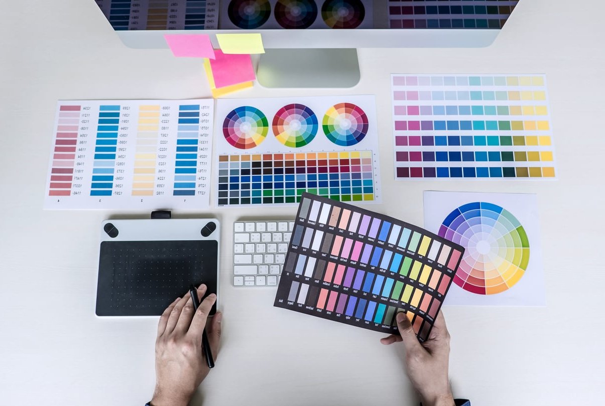
Step 3: Refine Your Palette into a Brand System
A raw extraction usually gives you five to ten colors. For a brand, that is too many. Reduce and organize them into clear roles:
- Primary color: The dominant brand color used on logos, headers and primary buttons.
- Secondary color: Supports the primary and adds variety to layouts.
- Accent color: Used sparingly for calls to action and highlights.
- Neutrals: Two or three muted tones for backgrounds, text and dividers.
If your extracted colors are too saturated or too dark, adjust their brightness and saturation slightly in Coolors or Adobe Color until they feel balanced as a system.
Step 4: Check Accessibility and Contrast
A beautiful palette is useless if users cannot read your text. Before locking in your colors, verify that key combinations meet WCAG contrast standards.
- Aim for a contrast ratio of at least 4.5:1 for normal text.
- Aim for at least 3:1 for large text and important UI elements.
- Test every combination you plan to use, especially primary on white, white on primary, and accent on neutral backgrounds.
Free contrast checkers like WebAIM Contrast Checker or the built in checker in Adobe Color will flag failing combinations instantly. If a color fails, darken or lighten it until it passes, then update your palette.
Step 5: Test for Versatility
Your palette must perform across every brand touchpoint. Before approving it, run these quick checks:
- Logo test: Does your logo remain legible in primary and inverted versions?
- Web mockup: Build a simple landing page mockup and check headers, body text, buttons and backgrounds.
- Social media test: Create a sample Instagram post and a LinkedIn banner with the palette.
- Print test: Print a sample on coated and uncoated paper. Some screen colors shift significantly in print.
- Dark mode test: Verify how your palette behaves on dark backgrounds for modern web and app interfaces.
Step 6: Document Your Palette
Once you have a final palette, document it properly so your team and partners can use it consistently. A minimal brand color sheet should include:
- Color name and role (primary, secondary, accent, neutral)
- HEX, RGB and CMYK values
- Pantone equivalent if you plan to print
- Approved background combinations
- Forbidden uses, for example accent color on large surfaces

Applying Your Palette to Web Design
When implementing the palette on a website, follow the 60-30-10 rule as a starting point: There’s a good explainer over at colordesigner.io.
- 60% of the screen uses your dominant neutral or background color.
- 30% uses your primary brand color across sections, headers and key visuals.
- 10% uses your accent color for buttons, links and highlights.
Store your colors as CSS variables so updates remain centralized:
:root {
  --color-primary: #2A4D69;
  --color-secondary: #4B86B4;
  --color-accent: #E8A87C;
  --color-neutral-light: #F4F4F4;
  --color-neutral-dark: #1A1A1A;
}
Common Mistakes to Avoid
- Using too many colors: More than five core colors creates visual chaos.
- Ignoring contrast: Pretty does not equal readable.
- Trend chasing: A palette pulled from a trendy photo today may feel dated next year.
- Skipping documentation: Without a brand sheet, every team member uses slightly different shades.
- Not testing in context: A palette can look great as swatches and terrible inside a real layout.
FAQ
What is the best free tool to create a color palette from a photo?
Coolors and Adobe Color are the most popular choices because they balance ease of use with advanced editing. Canva is faster if you only need a quick four color palette for social posts. There’s a good explainer over at unsplash.com.
How many colors should a brand palette contain?
Most strong brands use between three and five core colors: one primary, one or two secondary, one accent, and one or two neutrals. Anything more becomes difficult to manage.
Can I extract a palette from multiple photos?
Yes. Some tools allow batch uploads, but a simpler approach is to extract palettes from each image separately and then merge the strongest colors manually in Coolors.
How do I make sure my palette is accessible?
Run every text and background combination through a contrast checker. Target a minimum ratio of 4.5:1 for body text. Adjust lightness rather than hue to preserve your brand feel.
Should I match my website colors exactly to the photo?
Not always. Photos often contain colors that are too saturated or too dark for screen use. Use the photo as inspiration, then refine each swatch for digital legibility.
Can I trademark a color extracted from a photo?
Colors themselves are difficult to trademark, but a unique combination used consistently across your brand identity can become legally protected as part of your overall trade dress in some jurisdictions. Consult a trademark professional for specifics.
Final Thoughts
Building a color palette from a photo is one of the fastest ways to create a brand identity that feels authentic and emotionally connected. Choose a meaningful image, extract the dominant colors with a free generator, refine them for accessibility and consistency, then document everything so your team can apply the palette confidently across every channel. This write-up is worth a look.
At PixelBright, we help brands turn visual inspiration into complete design systems. If you want a professional eye on your next color palette or full brand identity, get in touch with our team.