Serif vs Sans-Serif Fonts: Why Does It Matter?
Choosing between serif and sans-serif fonts is one of the most fundamental decisions in design, branding, and web development. Whether you are building a website, designing a logo, or formatting a document, the typeface you pick shapes how your audience perceives your message.
In this guide, we break down the visual and functional differences between serif and sans-serif typefaces, cover readability, brand perception, web performance, and give you clear guidance on which to choose for logos, body text, and headings.
What Is a Serif Font?
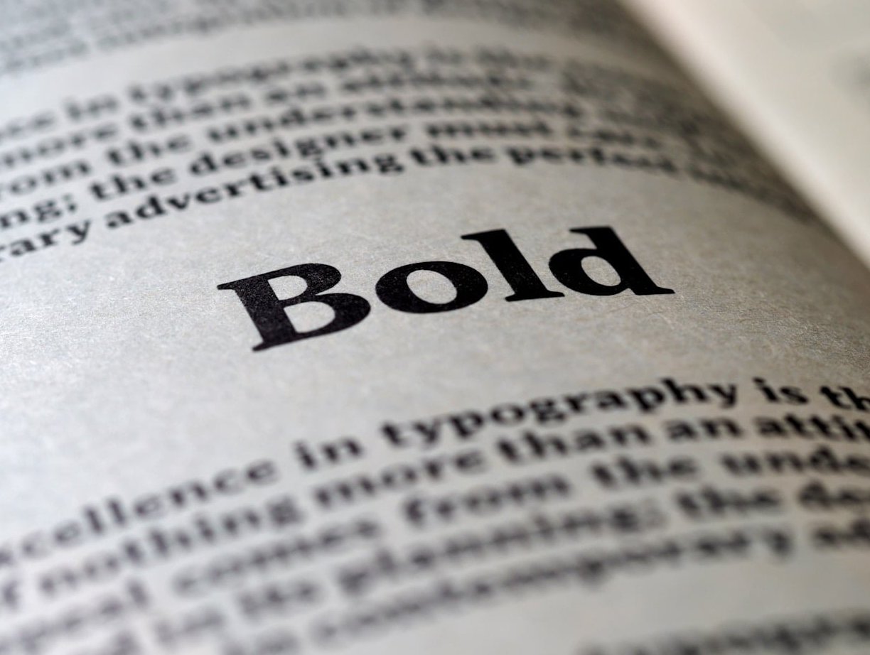
A serif font is a typeface that features small decorative strokes, often called “feet” or “tails,” attached to the ends of the main strokes of each letter. These small details have been a hallmark of typography since the earliest days of printed text.
Popular serif font examples:
- Times New Roman
- Georgia
- Garamond
- Playfair Display
- Merriweather
Serif fonts are commonly associated with tradition, elegance, authority, and formality. You will find them in newspapers, academic papers, book publishing, and luxury branding.

What Is a Sans-Serif Font?
A sans-serif font (“sans” meaning “without” in French) is a typeface that lacks the decorative strokes found in serif fonts. The letters have clean, straight edges, giving the text a streamlined and contemporary appearance.
Popular sans-serif font examples:
- Arial
- Helvetica
- Open Sans
- Roboto
- Inter
Sans-serif fonts are widely described as modern, friendly, minimal, and approachable. They dominate digital interfaces, tech branding, and startup culture.
Serif vs Sans-Serif: Side-by-Side Comparison
Here is a quick reference table highlighting the main differences:
| Feature | Serif Fonts | Sans-Serif Fonts |
|---|---|---|
| Decorative strokes | Yes (small “feet” or tails) | No |
| Overall feel | Classic, elegant, formal | Modern, clean, minimal |
| Best for print body text | Excellent | Good |
| Best for screen body text | Good (with proper sizing) | Excellent |
| Brand perception | Trust, authority, heritage | Innovation, friendliness, simplicity |
| Common industries | Law, finance, publishing, luxury | Tech, startups, healthcare, retail |
| Popular examples | Times New Roman, Georgia, Garamond | Arial, Helvetica, Roboto |
Readability: Serif vs Sans-Serif
The readability debate between serif and sans-serif fonts has gone on for decades. Here is what the evidence and practical experience tell us:
Print Readability
For long-form printed text such as books, newspapers, and magazines, serif fonts have traditionally been preferred. The small strokes help guide the eye along lines of text, making it slightly easier to read large blocks of copy on paper.
Screen Readability
On digital screens, sans-serif fonts tend to perform better, especially at smaller sizes. The clean lines render more crisply on pixels. This is why most major websites and apps default to sans-serif typefaces for body text.
However, with the advancement of high-resolution displays and improved font rendering in 2026, the gap has narrowed considerably. Well-designed serif fonts like Georgia or Merriweather can look beautiful and be perfectly readable on modern screens.
The Bottom Line on Readability
Research consistently shows that it generally does not matter much, as long as letter spacing is sufficient and the font is well-designed. What matters more than serif vs sans-serif is:
- Font size (at least 16px for body text on the web)
- Line height (1.5 to 1.75 is recommended)
- Contrast between text and background
- Letter spacing
- Avoiding high-contrast serif fonts where thin strokes can disappear on screens
Brand Perception: What Your Font Choice Says About You
Typography is a silent ambassador for your brand. The typeface you choose communicates personality traits before a single word is read.
When Serif Fonts Strengthen Your Brand
- Trust and credibility: Financial institutions, law firms, and government agencies often use serifs to convey reliability.
- Heritage and tradition: Brands with a long history lean on serifs to reinforce their legacy.
- Luxury and sophistication: High-end fashion labels and premium products frequently choose elegant serif typefaces.
When Sans-Serif Fonts Strengthen Your Brand
- Innovation and technology: Tech companies almost universally favor sans-serif fonts to feel cutting-edge.
- Approachability: Brands targeting younger or broader audiences use sans-serifs to feel welcoming.
- Simplicity and clarity: Minimalist brands rely on clean sans-serif typefaces to reduce visual noise.
Web Performance Considerations
Font choice can also affect how fast your website loads, which directly impacts SEO and user experience.
- System fonts load fastest. Using native system fonts like Arial, Georgia, or system-ui avoids extra network requests entirely.
- Web font file size matters. Some serif fonts with intricate details have larger file sizes than simpler sans-serif fonts. Always check the file size and only load the weights you actually need.
- Use font-display: swap. This CSS property ensures your text is visible while custom fonts are loading, preventing layout shifts and invisible text.
- Variable fonts save bandwidth. In 2026, variable fonts are widely supported and allow a single file to contain multiple weights and styles, reducing total download size for both serif and sans-serif families.
- Subset your fonts. If you only need Latin characters, do not load the full character set.
At Pixelbright, we always audit font loading as part of our web performance optimization process to ensure typography choices never slow down a site.
When to Use Serif vs Sans-Serif: Practical Guidelines
Here are our recommendations based on common design contexts:
For Logos
| Use Serif If… | Use Sans-Serif If… |
|---|---|
| You want to project authority and tradition | You want to feel modern and approachable |
| Your brand is in law, finance, or luxury | Your brand is in tech, health, or retail |
| You value timelessness over trend | You want maximum versatility across sizes |
For Body Text
- Print (books, brochures, reports): Serif fonts like Garamond or Georgia are excellent choices.
- Web and mobile: Sans-serif fonts like Inter, Roboto, or Open Sans are safe and highly readable defaults.
- Either can work well on modern high-resolution screens, as long as you follow good typographic practices (adequate sizing, spacing, and contrast).
For Headings
- Serif headings + sans-serif body: This is a classic pairing that creates visual hierarchy and contrast. The serif heading feels authoritative, while the sans-serif body stays easy to read.
- Sans-serif headings + serif body: Less common but equally effective, this combination can feel fresh and editorial.
- Same family for both: If you prefer a unified look, pick a font family that offers enough weight variation to differentiate headings from body text.
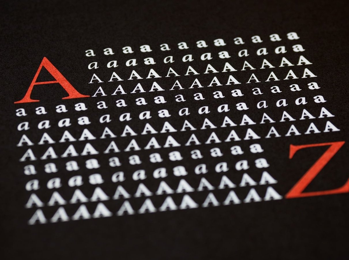
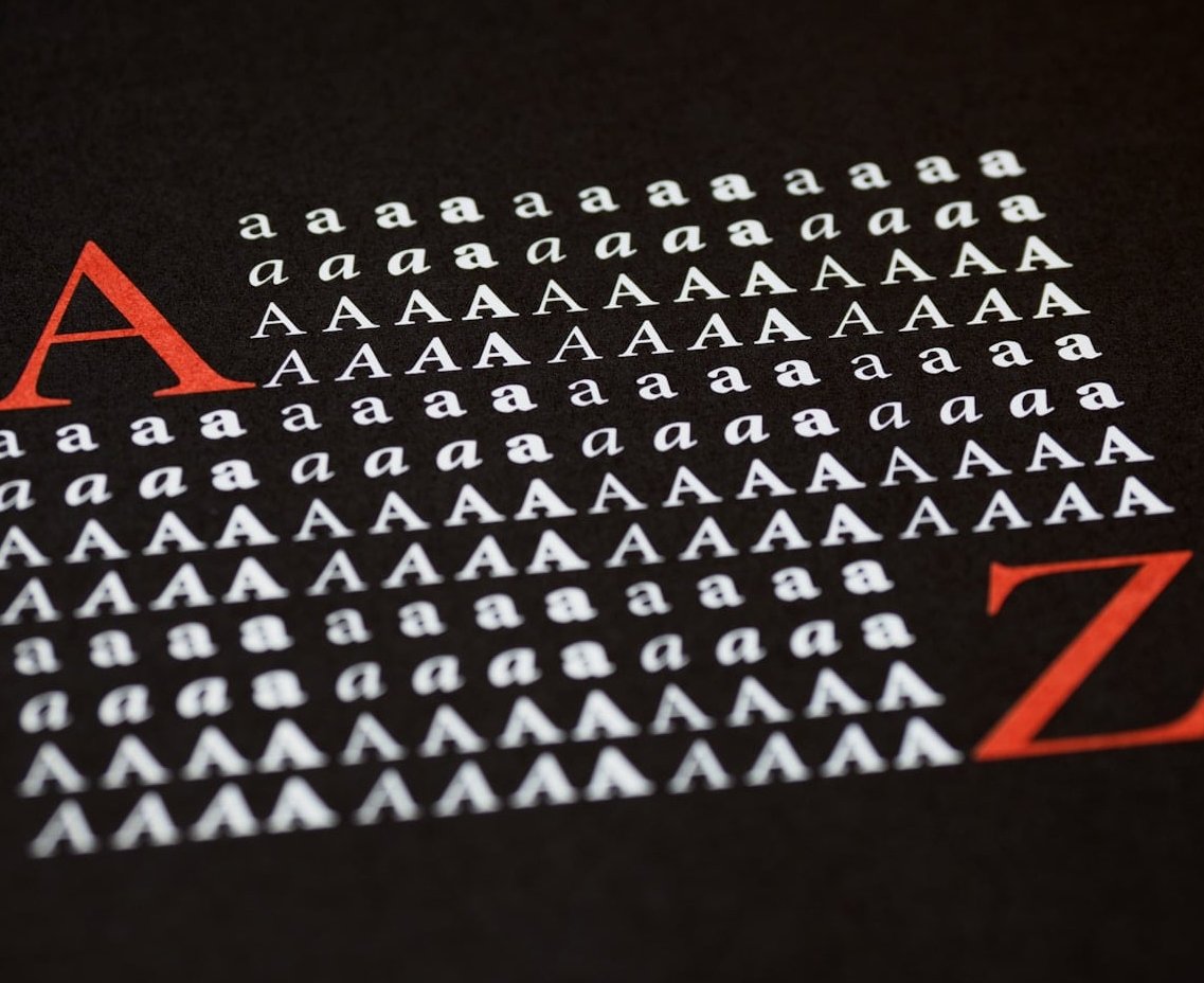
The 4 Main Types of Serif Fonts
Not all serif fonts are the same. Understanding the subcategories can help you make a more informed choice:
- Old Style (Humanist): Inspired by calligraphy. Low contrast between thick and thin strokes. Examples: Garamond, Palatino.
- Transitional: More contrast than Old Style, with sharper serifs. Examples: Times New Roman, Georgia.
- Didone (Modern): High contrast between thick and thin strokes. Dramatic and elegant. Examples: Bodoni, Didot.
- Slab Serif: Thick, blocky serifs. Bold and attention-grabbing. Examples: Rockwell, Courier.
Each type carries a different visual personality, so the right serif font depends on the specific mood and context you are designing for.
Accessibility: Serif vs Sans-Serif
Accessibility is a critical factor when choosing a typeface. Here are the key considerations:
- Dyslexia-friendly fonts: While no single typeface is universally better for dyslexic readers, many accessibility experts recommend simple sans-serif fonts with distinct letterforms (like Open Sans or Atkinson Hyperlegible). Avoid fonts where letters like “b,” “d,” “p,” and “q” look too similar.
- Low vision: For users with low vision, font weight, size, and contrast matter far more than whether the font is serif or sans-serif.
- Avoid decorative or high-contrast serifs for body text, as the thin strokes can become invisible at smaller sizes or on lower-quality displays.
- Always test your chosen font at various sizes and on multiple devices before committing to it for a project.
Mixing Serif and Sans-Serif Fonts: Best Practices
Combining serif and sans-serif fonts is one of the most effective ways to create visual interest and hierarchy. Follow these tips:
- Stick to two fonts maximum for most projects. Adding a third should be done sparingly and only when there is a clear reason.
- Create contrast. Pair a bold serif heading with a light sans-serif body, or vice versa. The more different the two fonts look, the better the pairing usually works.
- Match the mood. Make sure both fonts align with your brand personality. A playful sans-serif paired with a formal serif can create a confusing message.
- Check x-height compatibility. Fonts with similar x-heights (the height of lowercase letters) tend to pair more harmoniously.
Our Recommendation for 2026 and Beyond
The “best” font type depends entirely on your project goals, audience, and medium. Here is our quick decision framework:
- Choose serif when you want to convey tradition, credibility, elegance, or editorial sophistication.
- Choose sans-serif when you want to feel modern, clean, tech-forward, or highly legible on digital screens.
- Mix both when you want visual hierarchy and a polished, professional look that balances tradition with modernity.
The most important thing is to be intentional. Every typeface choice communicates something. Make sure your fonts align with the story your brand wants to tell.
Frequently Asked Questions
Is Arial a serif or sans-serif font?
Arial is a sans-serif font. It was designed in 1982 as a clean, versatile typeface and has been one of the most widely used sans-serif fonts on the web and in operating systems ever since.
Is Times New Roman a serif or sans-serif font?
Times New Roman is a serif font. It was originally commissioned by The Times newspaper in London in 1931 and remains one of the most recognized serif typefaces in the world.
What is the 3 font rule?
The 3 font rule is a design guideline that recommends using no more than three different fonts in a single project. Typically this means one font for headings, one for body text, and optionally a third for accents or special elements. Many designers prefer to limit it to just two fonts for simplicity.
Are sans-serif fonts better for people with dyslexia?
There is no definitive proof that sans-serif fonts are universally better for dyslexic readers. However, simple sans-serif fonts with distinct, unambiguous letterforms and generous spacing are generally recommended by accessibility specialists. Fonts like Atkinson Hyperlegible and Open Sans are popular choices.
Can I use a serif font on a website?
Absolutely. Modern screen technology in 2026 renders serif fonts beautifully. Just make sure to use an appropriate font size (16px or larger for body text), adequate line height, and good contrast. Well-designed web serif fonts like Georgia, Merriweather, and Lora are excellent options.
Which font type is better for SEO?
Neither serif nor sans-serif fonts directly impact SEO rankings. However, your font choice affects user experience metrics like time on page, bounce rate, and readability, all of which indirectly influence SEO. Choose whichever font type makes your content easiest and most pleasant to read for your specific audience.